Recent Posts

Showing posts with label layout. Show all posts

Tuesday, 19 October 2010

Market Week - Identity

Recently completed and handed in today, another day/short Identity brief set, again live but for part of the University programmes in the future. Market week, is all about producing shows/exhibitions of work by people involved in Leeds College of Art wether they are Students, alumni, staff or associates. The shows/exhibitions are a basis for networking among the creative community and to build business opportunities for both applicants and 'customers' The concept seems strong, and interesting to create some visuals for them. The brief asks for a logo, then some sample layouts of potential outcomes. 


With such a wide focus for visuals, taking a more conceptual approach would allow me to create more universal visuals but still with an underlying theme. Ive been recently been working on spirograph stylised patterns (shown above) for another brief/personal use, so as a starting point worked with that.


Reverting to solid colours instead of line drawing created some interesting patterns, and with 'overprinting' separate colours, allowed for real potential.


Combining different colours together created much more interesting patterns, and became the basis for the concept I was trying to visualise. Combining individual talents (separate colours) to provide new and exciting opportunities. From there, the design progressed and type was introduced.


From L-R 

Logo
Invitation
Banner
leaflet/promo layout

Typeface used - Gotham Rounded

In the final layouts, I included a QR code to the designs to add a little depth/third dimension to the design. A QR code is a interactive barcode using a smartphone or webcam for augmented reality (or in this case) an interactive link to an online resource, wherethe a image, website or message. I included it to allow the user to be directed to a website (in this case the college website) If you have an Android/blackberry/iphone with a barcode scanner application, try it out!


I really enjoyed this brief, another relatively fast turn around piece of design to add to the portfolio. Really happy with the outcome, and will hopefully continue with more opportunities like it.


Tuesday, 25 May 2010

The board layouts.


Just layouts. the content is on the blog and will be selected and laid out properly, instead of rushed for the crit.

Monday, 24 May 2010

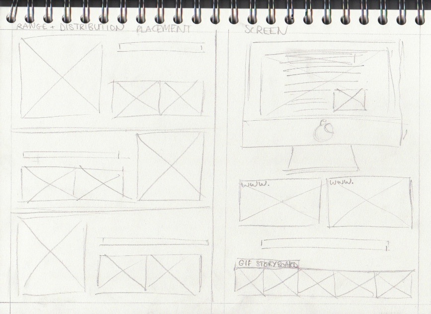
Placement.


SCREEN. train type.


Combining the banner designs and layouts allowed for designs to spread across the screen and attract more attention. The variety of banner sizes helped with placement of type and logo. The phrase did not fit into the rectangle where as the skype logo does perfectly. Selecting websites that are relevant help with the placement including National rail and Lonely Planet - the travel website shown here. 

Saturday, 22 May 2010

Bringing people together, with skype and coffee.


The dust is settling.

Dusting placement! Its all coming together now.. to create the advert for the coffee/dusting typeface, another placement and contextual reference was required to create the right effect. Because the typeface needed to be applied to something, I chose white napkins laid out for the text to sit on top which i feel worked quite well (at the bottom) but also include a coffee and mobile device of some kind that you can use skype on.


After experimenting with a few layouts came to the decision to use a close up portrait, to draw attention to the key objects in the scenario. The additional strap-line wasn't as crucial so just 'Social' was added above the skype logo (decided as the dusted version with the same technique)

The final typeface over the different attempts was the helvetica typeface, so it was much more readable and had a more authentic quality. The mistakes that give the unique and natural look have been detained and sit quite well on the advertisement.

To the pub.


Tweaking some layouts at The Packhorse pub, where I managed (and my helpers) got a table with a good amount of natural light to photograph and work on different layouts. Zoomed out, close up and directed shots to allow for variations depending on possible additional advertising formats. My favourite of the images was the bottom image because of the additional interaction taking place. I didn't want to the image to feel set up so my two models were left to their own devices, sip drinks chat and interact with the surroundings. I feel the results came out quite well.

From previous crits, the addition of another strapline was advised to re-enforce the designs, so one has been applied after some development.

'Plan your night over skype, and bring people together'

Purely as an addition, and not to draw attention from the main focus. 

Wednesday, 19 May 2010

Card distribution ideas.


Working with some layouts for card handouts, taken from card sketch models and sketches.

Thursday, 13 May 2010

Dust context?

To re-enforce the type composition a little better, I wanted to apply a little more context to the composition. Just as a tester, Ive taken a cafetier'e with coffee cup and applied. where-the its strong enough still will decide on the crit.


One composition ready for the crit!

Tuesday, 23 March 2010

Boards and printing


Thursday, 18 March 2010

Leaflet Finals


Thursday, 4 February 2010

Type Session 3 - Kitten Leaflet