Overall I've really quite enjoyed this brief. Originally when we were proposed this brief I was a little anxious about what was in store, in the previous brief with a collaborative partner decisions were shared and direction was taken forward together. For this brief it felt at first like the complete opposite.. What do I like? What do I want to produce? What limitations do I have? The first time you write a brief feels very weird, calling all the shots and making decisions with noone to tell you different.
At the end I'm quite surprised with the results, I'm quite proud of what I've achieved with the time I've had and with few limitations to what direction I can take. A strength to the brief has been the ability to create and experiment in some cases so much more than I would. I had a small set of guidelines to produce typefaces which would eventually promote skype and was left to it. I think writing the brief yourself makes it much more personal, and much more important to achieve in. The nature of the brief mean't I wasn't by a mac all of the time and sketching to try and visualize ideas, it was more of a case of trial and error throughout the brief. If something worked, I kept it and tweaked it, if something didn't then it was reattempted or stopped altogether, making progress and developing stronger ideas gradually.
I think that was one of the weaknesses of the brief throughout the 5 weeks, I knew how long I had to produce a body of work but the brief was very open ended, knowing I had to produce typefaces but with fewer other restrictions. Should I have set time scales to produce certain amounts of type tests for certain dates? Would I have produced worst typefaces because I would of felt rushed? or more possibilities to have a wider variety? should this of been one of the considerations to direct the brief throughout?
Crits and feedback sessions were really varied in quality throughout, the 'show and tell' crit we had wasn't as expected, not with the actual feedback I received but with how people used the time. In the partners I received only 3 pieces of feedback from the entire group whereas we (my pair) made the effort to give constructive feedback to each member of the group which felt alittle selfish. I did enjoy the initial concept crit for deciding briefs and the final crit format. Both felt like very professional environments and I came away with really useful feedback for both.
Since beginning the brief and as I have progressed, the idea of directing my own brief and creating my own projects seems so much more inspiring to direct what I produce, I'm realizing so many things i want to produce that I haven't considered before- more identities, merchandise, skateboards, DVD covers. I think I'm going to enjoy writing my own over summer.
Recent Posts
Showing posts with label skype. Show all posts
Showing posts with label skype. Show all posts
Friday, 28 May 2010

Tuesday, 25 May 2010


The board layouts.


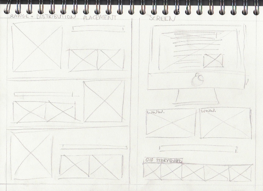
Just layouts. the content is on the blog and will be selected and laid out properly, instead of rushed for the crit.
Sunday, 23 May 2010
Change platforms, delayed, but still moving.


Long story short, I was not happy. With the other two resolutions near completion, I didn't think the train ticket type represented the quality and I decided to recapture the typefaces. Changes are subtle but the typeface this time was scanned instead of photographed to control the quality and eliminate variations between images. the process was suprisingly effective, only taking around 2/3 of the time of the original which was a bonus and is definitely worth it.
Playing with the formats once again, it had been recommended to me I change the layout of the letterforms as one continuous sentence to make it much more readable. This allowed for a variety of placements to let the typeface have its full potential.
Saturday, 22 May 2010
The dust is settling.
Dusting placement! Its all coming together now.. to create the advert for the coffee/dusting typeface, another placement and contextual reference was required to create the right effect. Because the typeface needed to be applied to something, I chose white napkins laid out for the text to sit on top which i feel worked quite well (at the bottom) but also include a coffee and mobile device of some kind that you can use skype on.


After experimenting with a few layouts came to the decision to use a close up portrait, to draw attention to the key objects in the scenario. The additional strap-line wasn't as crucial so just 'Social' was added above the skype logo (decided as the dusted version with the same technique)
The final typeface over the different attempts was the helvetica typeface, so it was much more readable and had a more authentic quality. The mistakes that give the unique and natural look have been detained and sit quite well on the advertisement.
To the pub.


Tweaking some layouts at The Packhorse pub, where I managed (and my helpers) got a table with a good amount of natural light to photograph and work on different layouts. Zoomed out, close up and directed shots to allow for variations depending on possible additional advertising formats. My favourite of the images was the bottom image because of the additional interaction taking place. I didn't want to the image to feel set up so my two models were left to their own devices, sip drinks chat and interact with the surroundings. I feel the results came out quite well.
From previous crits, the addition of another strapline was advised to re-enforce the designs, so one has been applied after some development.
'Plan your night over skype, and bring people together'
Purely as an addition, and not to draw attention from the main focus.
Thursday, 20 May 2010
All aboard.

New typeface. working with train tickets to encourage and promote travelling skype, possible mobile devices and how skype can be used on the move and not just on your home computer. This typeface was medium driven and arranged to a rough scale unlike the bottlecaps type, following a subtle template.


I'm a little undecided about the typeface as it is, the letterforms were photographed and then edited in PS to remove the background. In places it does look a little untidy and size of letters could be a little bit more consistent. Although not to waste the composition, I applied it to a variety of different locations in placement to see how it works in an environment.

I'm quite happy with the placement. I feel the typeface itself will be enough to give the right impression across and where the composition will be place is key to the design. train stations, transport and other travel spots, including screen.
Wednesday, 19 May 2010
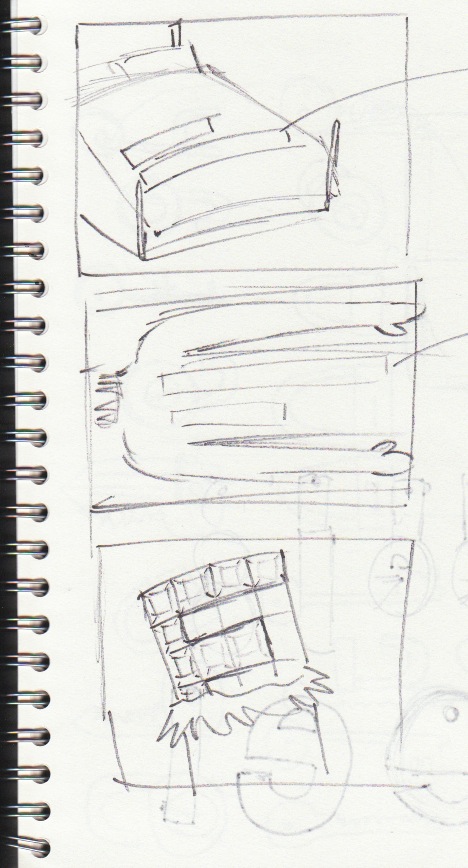


Post Crit. The fire has been lit.
Woah. Pretty strange crit. The crit was of a show and tell format, where your work was left to explain itself, and then pairs would walk round and comment on your work. I didn't mind the format at first, both my partner Hannah and Myself gave feedback to everyone in the crit both of something constructive and positive, and something that could be worked on if we saw fit, but unfortunately that wasn't seen through many peoples eyes. I had feedback from 4 pairs in total, with repetition of the same points. Too brown? what stock? too brownnn..

I wasn't feeling too confident until I found the mountain of a list from Rebecca and Heather they had wrote me :) the bloomin' legends!
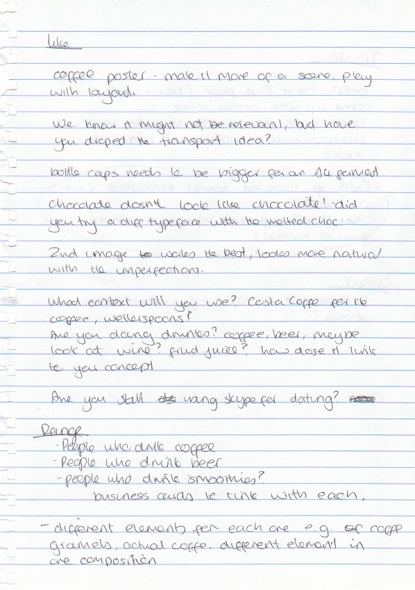
they had considered the designs and suggested directions in which to take, and raised a few key points to consider to do with context, and placement of the final adverts, they had even wrote me a to-do list!
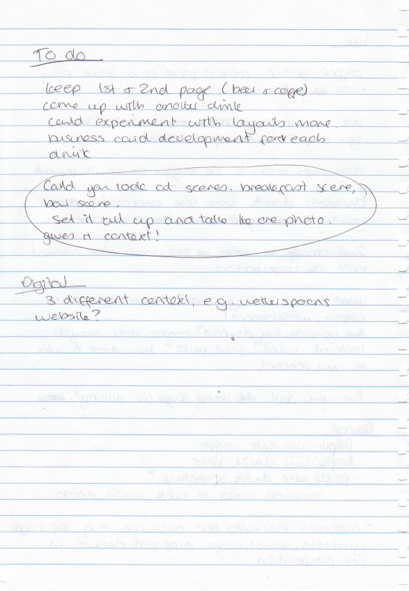
Taking on board what was set, I knew what was needed to produce and create effective pieces. The typefaces needed more context, the possibility of a scenario to apply to and re-considering the audiences and possibilities.

Pre crit. Visuals to show.
The Typefaces! 4 typefaces so far in the development, I can see atleast one dropping from the lineup and more taken further. Heading to the crit with an open mind and ready from criticism.

The bottlecap type is my favourite so far, and will be interesting to find out what people think.


Undecided between these two, very similar with technique but both with a slightly different approach.

Monday, 17 May 2010
Dusty road ahead.
Progress! this is working much better. As progression from the initial stencil, a stronger more defined typeface works much better. The majority of Skype's type on their website and promotional material is Helvetica, so seemed an obvious choice to develop from. I don't want to look into type theory and the visual queues and their emotions carried with them, I feel that would be developing and expanding the wrong and irrelevant direction.

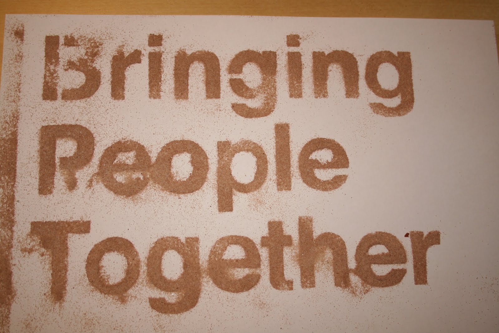
The selected typeface makes the dusting much more readable and more pleasant to read. The imperfections of over dusting and stencil bleed add to its advantage, giving a unique look carried with how drinks are dusted originally. Even a unique approach as unique as conversations through skype (if you want to reach that far.) I really really like this, and I hope it makes it through development to something more final.


Using the same technique I made a skype logo stencil and recreated skype in helvetica for more experimentation if a composition is formed.
Thursday, 13 May 2010
Another one bites the dust(ing)
Oh my, think I'm on to something here. When Emma (my sister) and I were younger, we had some tupperware stencils to use with crayons and pencils to draw around.. For some reason I brought them to uni when I started, and now I have a use for them! Trying out the dusting technique, I have a upper and lower case stencil to use, and so how the material reacts and if its easy to edit. Obviously has its flaws, its so easy to ruin when dusting, but it does leave a really nice effect.


The fade and weight of the letterforms change depending on the amount dusted. It leaves a really nice effect and makes the design look much more natural.

I tried on top of a drink and came across a few problems. The type will have to be tiny and accurate in order to dust on a drink with the right consistancy. The drink subsides and the type loses readability quite quickly, which again makes it hard to photograph.

Using the stencil, I recreated the phrase by dusting individual letter. First impressions, I'm really impressed, how what was a kids art toy was used to create a pleasing little bit of typography. Aligning the type was quite difficult, and not disturbing the other dusted letters, at parts it leaves a nice quality, but the arrangement may be seen as childish? might need some feedback on this..

I tried 'skype' with the possibility of applying to a card of some kind, to share with other people, and a logo opportunity.
Tuesday, 11 May 2010
Show me the money.

Moneh. I do like how this particular treatment has turned out on the first go, although controlling the letterform size isn't as much as a problem as I had imagined, one obvious let down is the background where the letterforms were created, in final production, the letters will have to be professionally photographed in the right environment to remove shadows and blend backgrounds to make the letterforms much more workable.


Logo treatments once again to put variations on the strong colour scheme already in use.
Anybody who knows how to show print marks on a file in photoshop to show scale, please let me know :)
The idea!

Ok, using the second chocolate typeface, Ive laid out a advert (48 sheet billboard format) to see how everything looks. Obviously because the end product is the promote Skype so the logo was applied but the colour scheme was a little too different for the chocolate colours. For this idea I applied a chocolate closeup taken as the main colour scheme.


Another variation to just change the hue/saturation of the original logo, to create different colour schemes, undecided which is more effective. More colours needed! With screen based formats researched, I want to try how the typeface works on different formats.