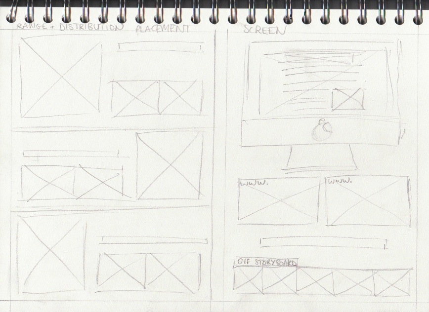
Dusting placement! Its all coming together now.. to create the advert for the coffee/dusting typeface, another placement and contextual reference was required to create the right effect. Because the typeface needed to be applied to something, I chose white napkins laid out for the text to sit on top which i feel worked quite well (at the bottom) but also include a coffee and mobile device of some kind that you can use skype on.
After experimenting with a few layouts came to the decision to use a close up portrait, to draw attention to the key objects in the scenario. The additional strap-line wasn't as crucial so just 'Social' was added above the skype logo (decided as the dusted version with the same technique)
The final typeface over the different attempts was the helvetica typeface, so it was much more readable and had a more authentic quality. The mistakes that give the unique and natural look have been detained and sit quite well on the advertisement.