Recent Posts

Showing posts with label type. Show all posts

Tuesday, 23 November 2010

Guy Ritchie. New Direction/concept.

When the Guy Ritchie brief came to a halt, I still wanted some completion of work without wasting anymore time dwelling with the brief, something needed to be resolved in a relatively short amount of time, to allow time to be spent on other briefs and continue with a variety of work. With previous directions, there are aspects of the design that have worked but It has never felt full and resolved as a concept. I really like the bold colour and simple type, to the point, clean and blunt in ways like the films are by Guy Ritchie.  With this once again as a starting point, I feel I can progress further with a design and add a new element.   

In the Market Week brief completed previously, I added a QR code to the bottom right-hand corner of the design to promote screen based visuals on printed medium. A QR code allows you to use a smartphone to scan the QR code and automatically direct you to a piece of information on the internet to further enhance the experience. I first found QR codes promoting applications online for the android market, and the code was used to direct you to the market on the phone. With this technology in place, websites online allow for personal generated QR codes for any sort of link, giving the scope to produce own related online content on print.

This technique has been used before, with Pepsi Cola and certain TV programmes during adverts, but hasn't really taken off until now. I feel incorporating this technology into advertising with appeal to a growing audience owning smart-phones (Just over 60 Million users in the EU)

Including a QR code to the design adds another element to consider screen (which was the original intention) With the audience of the poster scheme a little lost, adding the QR code should give more direction. The QR code could be seen as a reminder for previous audiences or encouragement to investigate further with the film.

Monday, 18 October 2010

Guy Ritchie - Poster Development

Back to the original idea of simple type on colour, has been developed further with a small illustration depicting part of the film in someway, not always critical but still important to the plot and usually its many twists and turns throughout. With the posters I didn't want the obvious phrase/imagery with each film that is always remembered, but to provoke a new look on the film pull the audiences curiosity towards the poster. This as a starting point depending on the crit, will be the basis of the packaging/cover of the films. I feel once a starting point has been decided, I can move forward.


Thoughts please!

Sunday, 17 October 2010

MWA identity - Typeface No2

Inspired from the second MWA logo created, more defined letterforms were produced which lead to another typeface, again not as time consuming as expected, but work the investigation, a definite improvement over the first typeface, much more readable and experimental with diagonal lines.


 I feel much more successful, and has the potential to expand on.

Friday, 15 October 2010

MWA Identity. The next step.


From feedback of tutors/fellow students, I feel a slight revision of the logo was needed to see if any improvements could be made from what can be seen. It was questioned where the or not the colour combinations were required to enhance the logo and if the design was strong enough in a pure line-weight form.
Now the colour has been taken away, I feel the design had been 'over worked' and wasn't necessary to improve. Although I am happy with this logo, a little more development has been attempted to produce a more compact design.


Just mixing up what I already have, layering the shapes/letterforms created and dissecting different strokes to form new patterns, With the letters being M, W and A, I like the idea of symmetry with the logo so it made sense to just build from that with whats been produced. With the development, I ended up with the logo below. Although I do like the outcome, I don't think the architect is a big fan of Van Halen, which it only seems to remind me of every time I now look at it. If I'm ever in the position to design the identity of a heavy metal band with the initials 'MW' this will be the first place I look.


Thursday, 7 October 2010

Guy Ritchie - Quote development


Manipulation of a quote in indesign with a variety of fonts and colours, experimenting with what I have and coming to conclusions. You can see the development through the 20ish slides above.

Tuesday, 25 May 2010

Beermat final.


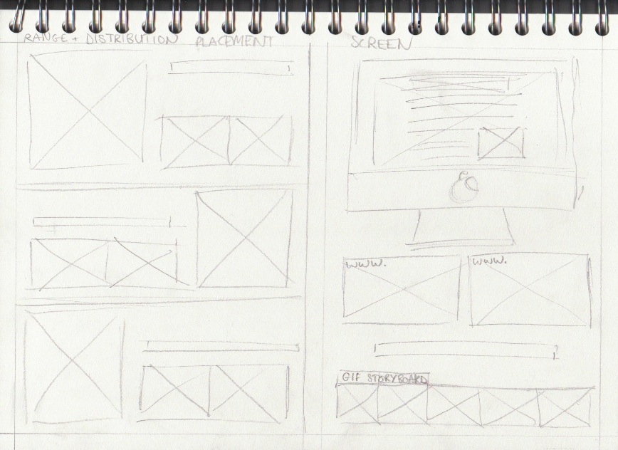
The board layouts.


Just layouts. the content is on the blog and will be selected and laid out properly, instead of rushed for the crit.

Monday, 24 May 2010

Placement.


Sunday, 23 May 2010

Change platforms, delayed, but still moving.


Long story short, I was not happy. With the other two resolutions near completion, I didn't think the train ticket type represented the quality and I decided to recapture the typefaces. Changes are subtle but the typeface this time was scanned instead of photographed to control the quality and eliminate variations between images. the process was suprisingly effective, only taking around 2/3 of the time of the original which was a bonus and is definitely worth it.

Playing with the formats once again, it had been recommended to me I change the layout of the letterforms as one continuous sentence to make it much more readable. This allowed for a variety of placements to let the typeface have its full potential.

Saturday, 22 May 2010

Bringing people together, with skype and coffee.


The dust is settling.

Dusting placement! Its all coming together now.. to create the advert for the coffee/dusting typeface, another placement and contextual reference was required to create the right effect. Because the typeface needed to be applied to something, I chose white napkins laid out for the text to sit on top which i feel worked quite well (at the bottom) but also include a coffee and mobile device of some kind that you can use skype on.


After experimenting with a few layouts came to the decision to use a close up portrait, to draw attention to the key objects in the scenario. The additional strap-line wasn't as crucial so just 'Social' was added above the skype logo (decided as the dusted version with the same technique)

The final typeface over the different attempts was the helvetica typeface, so it was much more readable and had a more authentic quality. The mistakes that give the unique and natural look have been detained and sit quite well on the advertisement.

To the pub.


Tweaking some layouts at The Packhorse pub, where I managed (and my helpers) got a table with a good amount of natural light to photograph and work on different layouts. Zoomed out, close up and directed shots to allow for variations depending on possible additional advertising formats. My favourite of the images was the bottom image because of the additional interaction taking place. I didn't want to the image to feel set up so my two models were left to their own devices, sip drinks chat and interact with the surroundings. I feel the results came out quite well.

From previous crits, the addition of another strapline was advised to re-enforce the designs, so one has been applied after some development.

'Plan your night over skype, and bring people together'

Purely as an addition, and not to draw attention from the main focus. 

Friday, 21 May 2010

Beermats!

I have a bottlecap typeface and need a way of applying it to the advertising in context still. Then another sweet idea as a turning point into developing the brief was to use beermats. Bloomin' beermats!
The ideas developed with the beermats to work on a variety of different formats, at first I only thought of displaying the composition created on a set of six and applying to a composition but ideas continued further with another element for the range. 


The coffee/dusting typeface forming has a disposable element with the dusting/business style cards to share, so why not beermats? It seems to make sense utilising something right in front of you which would just end up being disposed off anyway, could skype information be recorded onto the cards?


Lots and lots of tests.


Lots of cards were developed working with different layouts and logo treatments, including the treatment above with bottle-caps in century gothic and how it works on the scale format (94mm² 15mm radius)


Stock was important for the beermats to have an authentic quality to them, I found the cartridge paper mounted onto mount board gave a realistic card to work with.


I did experiment with different stock choices and see if off white or white worked best. Although off white worked better for beermats as an individual product, I decided on white purely for photographic quality in placement.


Obviously to get an authentic image, ill need the right location for a product shot. To utilise the beermat designs, an over head view to view the entire design and allow for ease of alterations. Just playing with a sample of layouts before one was decided and then off to be taken at a suitable pub. Pub for research and  development? Oh go on then.