Recent Posts

Showing posts with label superbrief. Show all posts

Monday, 24 May 2010

SCREEN. train type.


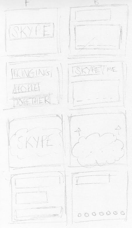
Combining the banner designs and layouts allowed for designs to spread across the screen and attract more attention. The variety of banner sizes helped with placement of type and logo. The phrase did not fit into the rectangle where as the skype logo does perfectly. Selecting websites that are relevant help with the placement including National rail and Lonely Planet - the travel website shown here. 

Friday, 21 May 2010

Beermats!

I have a bottlecap typeface and need a way of applying it to the advertising in context still. Then another sweet idea as a turning point into developing the brief was to use beermats. Bloomin' beermats!
The ideas developed with the beermats to work on a variety of different formats, at first I only thought of displaying the composition created on a set of six and applying to a composition but ideas continued further with another element for the range. 


The coffee/dusting typeface forming has a disposable element with the dusting/business style cards to share, so why not beermats? It seems to make sense utilising something right in front of you which would just end up being disposed off anyway, could skype information be recorded onto the cards?


Lots and lots of tests.


Lots of cards were developed working with different layouts and logo treatments, including the treatment above with bottle-caps in century gothic and how it works on the scale format (94mm² 15mm radius)


Stock was important for the beermats to have an authentic quality to them, I found the cartridge paper mounted onto mount board gave a realistic card to work with.


I did experiment with different stock choices and see if off white or white worked best. Although off white worked better for beermats as an individual product, I decided on white purely for photographic quality in placement.


Obviously to get an authentic image, ill need the right location for a product shot. To utilise the beermat designs, an over head view to view the entire design and allow for ease of alterations. Just playing with a sample of layouts before one was decided and then off to be taken at a suitable pub. Pub for research and  development? Oh go on then.

Tuesday, 18 May 2010

99 _______ sitting on the wall.


From the previous crit and development work, I decided to try working with bottle caps as a form of type medium. As Dad and myself are partial to a few ales now and again when i'm home, he for some reason kept hold of the caps. I asked him to send them some over, so I got cracking! 


From previous attempts are recreating type in this way, I found it hard to judge the scale well and keep the typeface workable and consistent throughout the letterforms. To solve this, I used a template printed on the sheet of paper (around 5% opacity) with century gothic for its rounded counter quality to base the typeface on. One of the decisions I've had to make while creating the typefaces is where-the to keep to an existing typeface, or have a medium directed typeface, and if they should all be the same? I suppose it varies between the medium and whatever looks visually more effective.


Applying a montage of the caps allows for the skype logo to be restyled in the relevant form. 

A possible layout of the type composition. Really really happy with this.

Monday, 17 May 2010

Helchoctica

The main event for the chocolate type. Part 3. using the majority of the chocolate slab I used another helvetica stencil and cut out the letter forms including counters, and i'm quite proud of it. Much more effective than previous chocolate type compositions. Only a few little problems with cutting out the letters, the chocolate drying up caused it to crack a little bit so that made it hard to manoeuvre but nothing else was a problem. Really happy with the result.


At an attempt to apply to chocolate into some more context, I placed the pieces on foil which to date I've found one of the hardest things to photograph (aswell as fireworks..) colours obviously aren't working here, so I will leave as it is for now, unless crits/feedback feel I should continue with the chocolate typefaces.


Skype? Another logo development to apply to a composition.. possible?

Friday, 14 May 2010

Face melter.


It was also suggested I work with melted type and melted chocolate. I was alittle unsure, but gave it ago. Working with the medium was interesting, I first attempted melting actual chocolate to write with but it didn't make it to a melted state.. (I may of over done it..) so instead i worked with chocolate sauce, of teh same consistancy, just to see how it writes.


You definitely don't have much control with the medium. letterforms vary in size, colour and style. The type looks a little untidy and wouldn't be very easy to apply to a theme/target audience.


For further development, I attempted to pour a sheet of the sauce to photograph and manipulate in photoshop. This again was much harder than planned, and results were disappointing. 


Although the fade does look quite nice on the logo treatment, you can't tell what the medium is, and again makes it obsolete. I feel another chocolate typeface needs to be done.


Thursday, 13 May 2010

Another one bites the dust(ing)

Oh my, think I'm on to something here. When Emma (my sister) and I were younger, we had some tupperware stencils to use with crayons and pencils to draw around.. For some reason I brought them to uni when I started, and now I have a use for them! Trying out the dusting technique, I have a upper and lower case stencil to use, and so how the material reacts and if its easy to edit. Obviously has its flaws, its so easy to ruin when dusting, but it does leave a really nice effect.


The fade and weight of the letterforms change depending on the amount dusted. It leaves a really nice effect and makes the design look much more natural. 


I tried on top of a drink and came across a few problems. The type will have to be tiny and accurate in order to dust on a drink with the right consistancy. The drink subsides and the type loses readability quite quickly, which again makes it hard to photograph.


Using the stencil, I recreated the phrase by dusting individual letter. First impressions, I'm really impressed, how what was a kids art toy was used to create a pleasing little bit of typography. Aligning the type was quite difficult, and not disturbing the other dusted letters, at parts it leaves a nice quality, but the arrangement may be seen as childish? might need some feedback on this..


I tried 'skype' with the possibility of applying to a card of some kind, to share with other people, and a logo opportunity.

Wednesday, 12 May 2010

Progress Crit. Feedback

Okay, bit of feedback time. Mixed thoughts and a few ideas raised to continue with, moving in to the crit I wasn't 100% confident and struggling with a little bit of a direction to work from. 'Bringing people together' I knew was working, just how to apply it and by how much. I took my chocolate type, money and screen experiments and saw what people thought.

The message of what was trying to be protrayed was a little lost just by itself, maybe not the right choice of medium for type? In the crit I did need to explain a little bit too much which proves things weren't working, but I did get a few positive feedback points to work from. The suggested cards as another dimension and range to the designs went down well, a way of sharing skype my handing cards out looks like a good direction to take.


Okay, so a few notes I made. Business cards good, but the typefaces need to be re-enforced alittle more. Try variations of the chocolate and placement of the advertising to give more context. What could be a good variation of chocolate could be dusting chocolate.. one I want to try straight away.

Tuesday, 11 May 2010

Show me the money.


Moneh. I do like how this particular treatment has turned out on the first go, although controlling the letterform size isn't as much as a problem as I had imagined, one obvious let down is the background where the letterforms were created, in final production, the letters will have to be professionally photographed in the right environment to remove shadows and blend backgrounds to make the letterforms much more workable.


Logo treatments once again to put variations on the strong colour scheme already in use.


Anybody who knows how to show print marks on a file in photoshop to show scale, please let me know :)

The idea!


Ok, using the second chocolate typeface, Ive laid out a advert (48 sheet billboard format) to see how everything looks. Obviously because the end product is the promote Skype so the logo was applied but the colour scheme was a little too different for the chocolate colours. For this idea I applied a chocolate closeup taken as the main colour scheme. 


Another variation to just change the hue/saturation of the original logo, to create different colour schemes, undecided which is more effective. More colours needed! With screen based formats researched, I want to try how the typeface works on different formats.


Monday, 10 May 2010

Coin typeface


As a medium to work with, coins were much easier than I thought they would be, the nature of the shapes and sizes allows for a much better ease of transition in weight of lines and curves. Although quite time consuming, the results are much more successful than other tests. Again photographs not great quality, just an experimentation to find faults and progress/development. What I found with the coins is keeping a scale consistant through the letterforms, obviously some are easier to create from others, but the simpler letterforms are smaller.. something that needs to be resolved.

Chocolate typeface. Round 2!


The first go wasn't as successful as planned, serifs and imitating a existing typeface seemed much more difficult than anticipated trying to interoperate serifs and weights of the stoke. The next typeface is directed by the medium and much easier to produce, this typeface took an hour or so compared to the 4-5 hours arranging the pieces creating serifs. photographs are of the highest quality, and purely for visual investigation of the chocolate. keeping the format to 4x5 chocolate chunks controlled the scale and the interoperation of the letterforms, something I didn't consider with the first typeface.

Thursday, 6 May 2010

Right in front of my face.

Although I had a strong concept/idea to create typefaces with found objects, the phrase/strapline which I was going to use was still undecided. After a progress crit with Fred earlier today, I found myself over complicating simple decisions as I always do and just running around in circles. From the first crit for the brief and SOI pitch, I had devised a concept statement inwhich to work from.

Bringing People Together.

Why the hell not just use that? It explains the intentions of the brief and fullfills the brief, and can be applied across different themes and medium. Right in front of me. 

Ok, so the next step is to apply the strapline to a variety of formats and see what works.

Tuesday, 4 May 2010

Chocolate typeface.

With the idea of creating typefaces related to different themes, the first I tried was a computer mouse typeface, related to business and now a chocolate typeface for love.


I wanted to just try working with it as a medium, and how easy it is to work with creating letterforms. It didn't work anything like I would, cutting chocolate to make new shapes, making serifs, curves and change in weight. I want to try chocolate directed shapes instead of remaking typefaces, make some more attempts, sans serif and some different formats and mediums further.

Monday, 3 May 2010

Phrases, content and potential.

After the crit, I once again broadened my horizons of a particular target audience/theme to produce for. Originally I was to contain my thoughts towards love/relationship for communicating through Skype, but was decided to try more themes and produce more type treatments for the skype advertising to produce. 


With a select group of themes/directions to take, I just began to pull a few ideas together for potential phrases/straplines to reflect Skype, and the idea of bringing people together. I summed it up quite well with what I wanted to produce with- Get across the idea of everyone you meet is seconds away

My Favourites so far-

-Feels like Home
-Like you never left
-The freedom of Speech*
*and video, files and messaging
-The Girl next door
-Fit right in 


I tried a few Oxymorons as potential phrases and recreating impossible scenarios that would show benefits of Skype EG someone while sat on a beach is having a video call with someone who is visiting the Eiffel Tower, and so on.


From the research on arranged typefaces and a direction for development, just a quick brainstorm so far of potential mediums to use to create letterforms. I especially like the idea of Chocolate, suncream, flowers and travel tickets to tray, with I will investigate.


A potential idea for recreating type for relocating, with keys and padlocks. initial idea with the scope for illustration/found object typography.