Recent Posts

Showing posts with label live. Show all posts

Wednesday, 3 November 2010

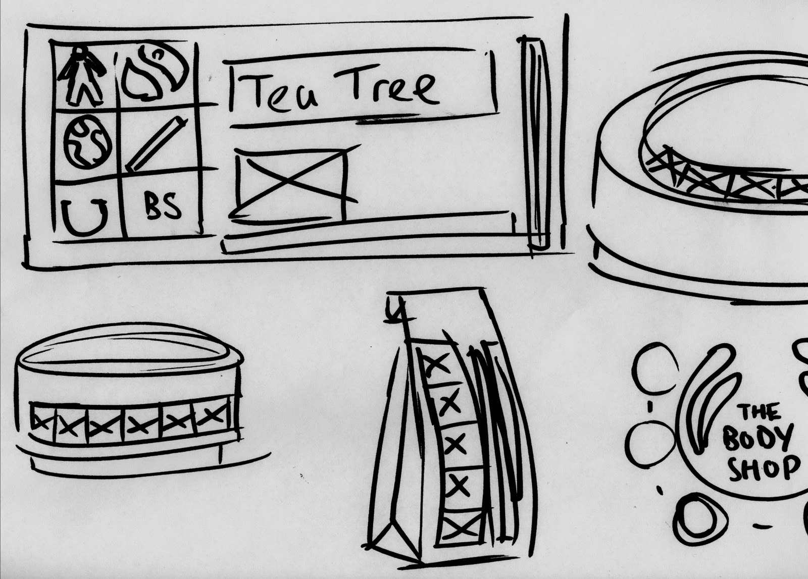
Body shop. Initial thoughts and starting point.


D+AD briefs/ISTD briefs/YCN briefs. Choices choices choices.


MWA Identity. What's next?

Its back! another identity thats progressed really well in recent weeks. After the crit feedback given, the potential of the MWA logo/identity hadn't been fully explored in terms of patterns and treatments of the logo itself. Taking the design back to B+W meant experimentation with line weight and subtle colour additions to the designs.


The final final logo (I promise) for Matthew Whatley Architecture. Edges and corners have been subtly rounded and the lower crossbar of the 'A' has been removed, to make a much stronger structure.


Letterhead and compliment slip development to include the repeat pattern created and include the logo and chosen typeface.


Colour treatments.


Tuesday, 2 November 2010

Sunglasses UK - Identity


Thursday, 21 October 2010

Kat Gardner - Identity - Initial ideas

Kat Gardner is a freelance baker and cake decorator I know from a part -time job who approached me about an identity for her work just to promote herself a little more. Her business works on word of mouth currently so business cards is a must, with the potential to expand and develop further with work. Weirdly first job was to devise a name for her freelance work, to allow business other than family and friends. 'Kat Gardner - Decorated Cakes' after various changes on a baking and decorating treatment, which just sounded like a decorator painter. Kat bakes and decorates from her own recipe from start to finish, so a personal approachable feeling is also a must. Her interests although might not be relevant is Japanense, currently taking a course in the language, might be nice to include some subtle influences into the designs.


With quite a scope of development/ideas to be had, just began with simple imagery and typographic treatments for logo ideas, working again with initials, small pictograms and general cake/cupcake imagery to draw conclusions to ideas.


With Kat producing cakes from start to finish, the idea of incorporating 'love and care' into the designs seemed like a no brainer. working on 'love and care in a cupcake' lead onto manipulating on screen where treatments could be produced relatively quickly. 'GDC' was a strong direction at this stage, twinning with small pictograms, but will only be decided with further development.


Tuesday, 19 October 2010

Market Week - Identity

Recently completed and handed in today, another day/short Identity brief set, again live but for part of the University programmes in the future. Market week, is all about producing shows/exhibitions of work by people involved in Leeds College of Art wether they are Students, alumni, staff or associates. The shows/exhibitions are a basis for networking among the creative community and to build business opportunities for both applicants and 'customers' The concept seems strong, and interesting to create some visuals for them. The brief asks for a logo, then some sample layouts of potential outcomes. 


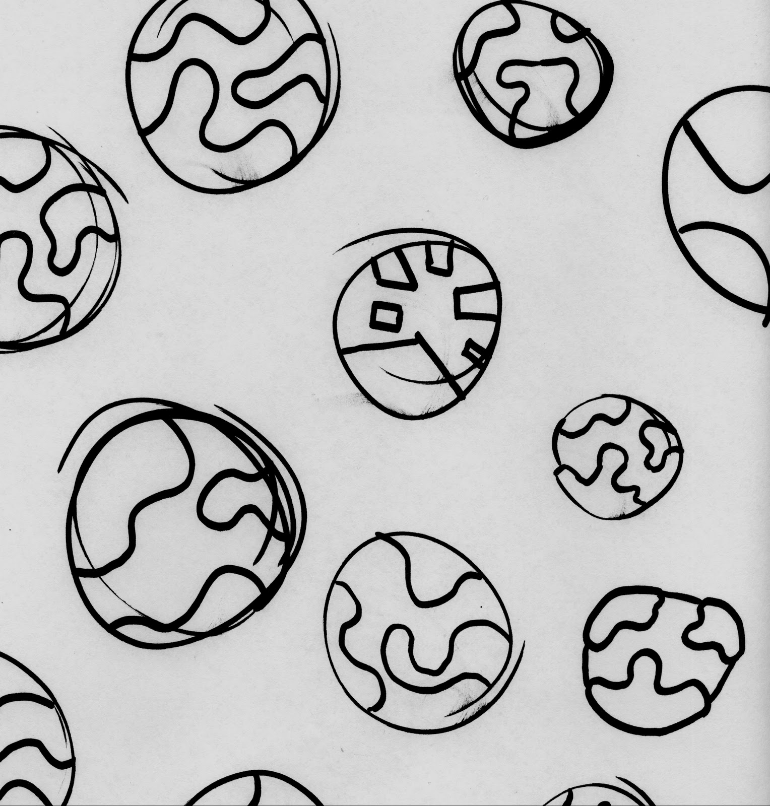
With such a wide focus for visuals, taking a more conceptual approach would allow me to create more universal visuals but still with an underlying theme. Ive been recently been working on spirograph stylised patterns (shown above) for another brief/personal use, so as a starting point worked with that.


Reverting to solid colours instead of line drawing created some interesting patterns, and with 'overprinting' separate colours, allowed for real potential.


Combining different colours together created much more interesting patterns, and became the basis for the concept I was trying to visualise. Combining individual talents (separate colours) to provide new and exciting opportunities. From there, the design progressed and type was introduced.


From L-R 

Logo
Invitation
Banner
leaflet/promo layout

Typeface used - Gotham Rounded

In the final layouts, I included a QR code to the designs to add a little depth/third dimension to the design. A QR code is a interactive barcode using a smartphone or webcam for augmented reality (or in this case) an interactive link to an online resource, wherethe a image, website or message. I included it to allow the user to be directed to a website (in this case the college website) If you have an Android/blackberry/iphone with a barcode scanner application, try it out!


I really enjoyed this brief, another relatively fast turn around piece of design to add to the portfolio. Really happy with the outcome, and will hopefully continue with more opportunities like it.