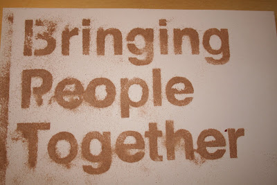
Progress! this is working much better. As progression from the initial stencil, a stronger more defined typeface works much better. The majority of Skype's type on their website and promotional material is Helvetica, so seemed an obvious choice to develop from. I don't want to look into type theory and the visual queues and their emotions carried with them, I feel that would be developing and expanding the wrong and irrelevant direction.
The selected typeface makes the dusting much more readable and more pleasant to read. The imperfections of over dusting and stencil bleed add to its advantage, giving a unique look carried with how drinks are dusted originally. Even a unique approach as unique as conversations through skype (if you want to reach that far.) I really really like this, and I hope it makes it through development to something more final.
Using the same technique I made a skype logo stencil and recreated skype in helvetica for more experimentation if a composition is formed.


0 comments:
Post a Comment