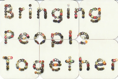
I have a bottlecap typeface and need a way of applying it to the advertising in context still. Then another sweet idea as a turning point into developing the brief was to use beermats. Bloomin' beermats!
The ideas developed with the beermats to work on a variety of different formats, at first I only thought of displaying the composition created on a set of six and applying to a composition but ideas continued further with another element for the range.
The coffee/dusting typeface forming has a disposable element with the dusting/business style cards to share, so why not beermats? It seems to make sense utilising something right in front of you which would just end up being disposed off anyway, could skype information be recorded onto the cards?
Lots and lots of tests.
Lots of cards were developed working with different layouts and logo treatments, including the treatment above with bottle-caps in century gothic and how it works on the scale format (94mm² 15mm radius)
Stock was important for the beermats to have an authentic quality to them, I found the cartridge paper mounted onto mount board gave a realistic card to work with.
I did experiment with different stock choices and see if off white or white worked best. Although off white worked better for beermats as an individual product, I decided on white purely for photographic quality in placement.
Obviously to get an authentic image, ill need the right location for a product shot. To utilise the beermat designs, an over head view to view the entire design and allow for ease of alterations. Just playing with a sample of layouts before one was decided and then off to be taken at a suitable pub. Pub for research and development? Oh go on then.


0 comments:
Post a Comment