Recent Posts

Wednesday, 19 May 2010

Set the scene.


Large scale?


Entire scenarios?


Individual segments?

Post Crit. The fire has been lit.

Woah. Pretty strange crit. The crit was of a show and tell format, where your work was left to explain itself, and then pairs would walk round and comment on your work. I didn't mind the format at first, both my partner Hannah and Myself gave feedback to everyone in the crit both of something constructive and positive, and something that could be worked on if we saw fit, but unfortunately that wasn't seen through many peoples eyes. I had feedback from 4 pairs in total, with repetition of the same points. Too brown? what stock? too brownnn..


I wasn't feeling too confident until I found the mountain of a list from Rebecca and Heather they had wrote me :) the bloomin' legends! 


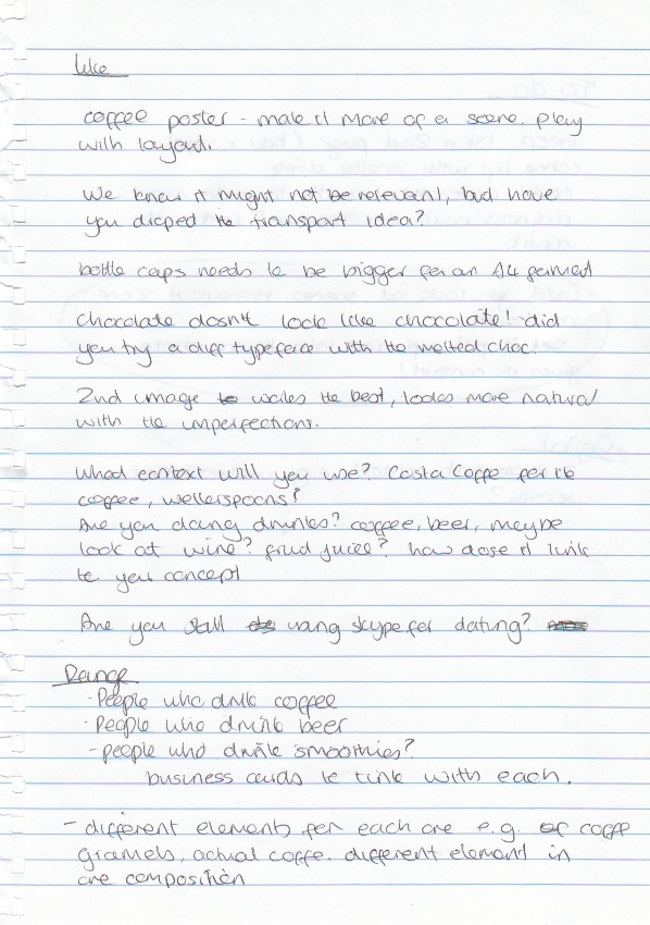
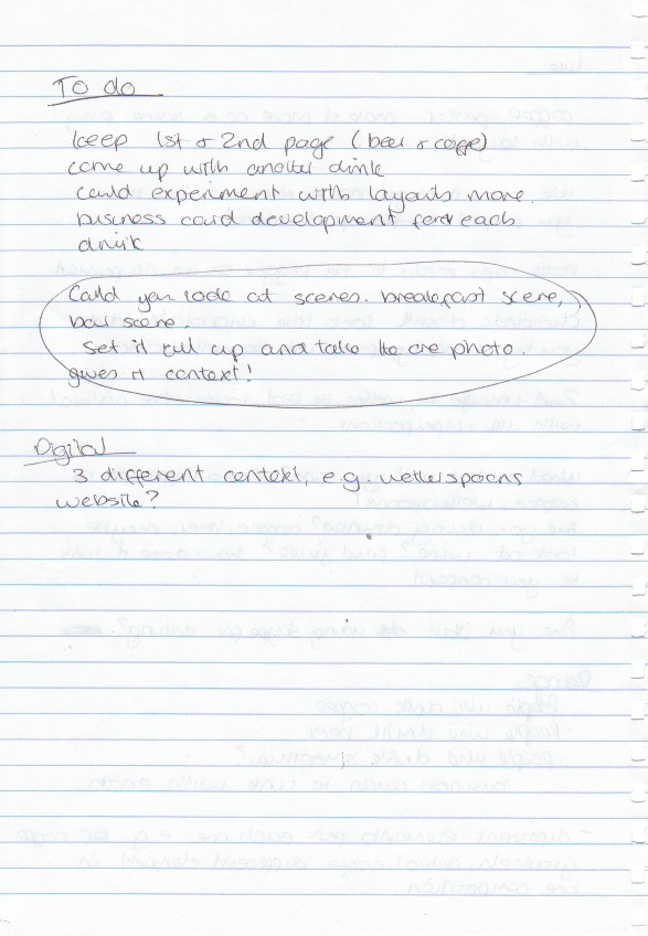
they had considered the designs and suggested directions in which to take, and raised a few key points to consider to do with context, and placement of the final adverts, they had even wrote me a to-do list! 

Taking on board what was set, I knew what was needed to produce and create effective pieces. The typefaces needed more context, the possibility of a scenario to apply to and re-considering the audiences and possibilities. 
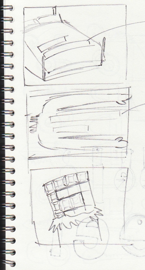
Pre crit. Visuals to show.

The Typefaces! 4 typefaces so far in the development, I can see atleast one dropping from the lineup and more taken further. Heading to the crit with an open mind and ready from criticism. 

The bottlecap type is my favourite so far, and will be interesting to find out what people think.


Undecided between these two, very similar with technique but both with a slightly different approach.

Card distribution ideas.


Working with some layouts for card handouts, taken from card sketch models and sketches.

Tuesday, 18 May 2010

99 _______ sitting on the wall.


From the previous crit and development work, I decided to try working with bottle caps as a form of type medium. As Dad and myself are partial to a few ales now and again when i'm home, he for some reason kept hold of the caps. I asked him to send them some over, so I got cracking! 


From previous attempts are recreating type in this way, I found it hard to judge the scale well and keep the typeface workable and consistent throughout the letterforms. To solve this, I used a template printed on the sheet of paper (around 5% opacity) with century gothic for its rounded counter quality to base the typeface on. One of the decisions I've had to make while creating the typefaces is where-the to keep to an existing typeface, or have a medium directed typeface, and if they should all be the same? I suppose it varies between the medium and whatever looks visually more effective.


Applying a montage of the caps allows for the skype logo to be restyled in the relevant form. 

A possible layout of the type composition. Really really happy with this.

Monday, 17 May 2010

Helchoctica

The main event for the chocolate type. Part 3. using the majority of the chocolate slab I used another helvetica stencil and cut out the letter forms including counters, and i'm quite proud of it. Much more effective than previous chocolate type compositions. Only a few little problems with cutting out the letters, the chocolate drying up caused it to crack a little bit so that made it hard to manoeuvre but nothing else was a problem. Really happy with the result.


At an attempt to apply to chocolate into some more context, I placed the pieces on foil which to date I've found one of the hardest things to photograph (aswell as fireworks..) colours obviously aren't working here, so I will leave as it is for now, unless crits/feedback feel I should continue with the chocolate typefaces.


Skype? Another logo development to apply to a composition.. possible?

Dusty road ahead.

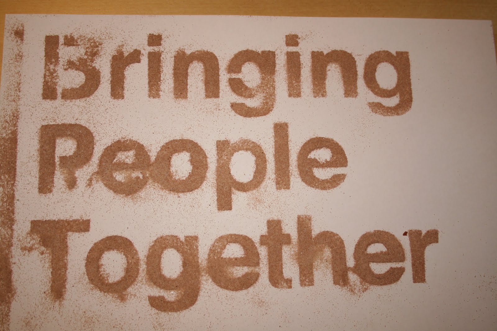
Progress! this is working much better. As progression from the initial stencil, a stronger more defined typeface works much better. The majority of Skype's type on their website and promotional material is Helvetica, so seemed an obvious choice to develop from. I don't want to look into type theory and the visual queues and their emotions carried with them, I feel that would be developing and expanding the wrong and irrelevant direction.


The selected typeface makes the dusting much more readable and more pleasant to read. The imperfections of over dusting and stencil bleed add to its advantage, giving a unique look carried with how drinks are dusted originally. Even a unique approach as unique as conversations through skype (if you want to reach that far.) I really really like this, and I hope it makes it through development to something more final.


Using the same technique I made a skype logo stencil and recreated skype in helvetica for more experimentation if a composition is formed.