Recent Posts

Thursday, 6 May 2010

Right in front of my face.

Although I had a strong concept/idea to create typefaces with found objects, the phrase/strapline which I was going to use was still undecided. After a progress crit with Fred earlier today, I found myself over complicating simple decisions as I always do and just running around in circles. From the first crit for the brief and SOI pitch, I had devised a concept statement inwhich to work from.

Bringing People Together.

Why the hell not just use that? It explains the intentions of the brief and fullfills the brief, and can be applied across different themes and medium. Right in front of me. 

Ok, so the next step is to apply the strapline to a variety of formats and see what works.

Tuesday, 4 May 2010

Chocolate typeface.

With the idea of creating typefaces related to different themes, the first I tried was a computer mouse typeface, related to business and now a chocolate typeface for love.


I wanted to just try working with it as a medium, and how easy it is to work with creating letterforms. It didn't work anything like I would, cutting chocolate to make new shapes, making serifs, curves and change in weight. I want to try chocolate directed shapes instead of remaking typefaces, make some more attempts, sans serif and some different formats and mediums further.

Monday, 3 May 2010

Mighty mouse typeface experiment.


I wanted to create something over a relatively short amount of time for experimentation. From initial thoughts of connecting people and bringing people together, I wanted to use the medium of a mouse (computer-mouse-skype program-connection)


Phrases, content and potential.

After the crit, I once again broadened my horizons of a particular target audience/theme to produce for. Originally I was to contain my thoughts towards love/relationship for communicating through Skype, but was decided to try more themes and produce more type treatments for the skype advertising to produce. 


With a select group of themes/directions to take, I just began to pull a few ideas together for potential phrases/straplines to reflect Skype, and the idea of bringing people together. I summed it up quite well with what I wanted to produce with- Get across the idea of everyone you meet is seconds away

My Favourites so far-

-Feels like Home
-Like you never left
-The freedom of Speech*
*and video, files and messaging
-The Girl next door
-Fit right in 


I tried a few Oxymorons as potential phrases and recreating impossible scenarios that would show benefits of Skype EG someone while sat on a beach is having a video call with someone who is visiting the Eiffel Tower, and so on.


From the research on arranged typefaces and a direction for development, just a quick brainstorm so far of potential mediums to use to create letterforms. I especially like the idea of Chocolate, suncream, flowers and travel tickets to tray, with I will investigate.


A potential idea for recreating type for relocating, with keys and padlocks. initial idea with the scope for illustration/found object typography.

Wednesday, 28 April 2010

Brief! Post Crit.

The crit went really well, getting feedback from the proposal and what everyone though. It made me think much more about what I want to achieve, originally listing what sort of work you want to produce, then applying it to a brief. From the crit, I opened my eyes a little bit to realise I may just be trying to incorporate ideas into the brief, because I want to do them and not considering wether or not it is relevant. From this, I'm considering dropping the ambient styles of advertising, and aim for more conventional techniques, depending on development.

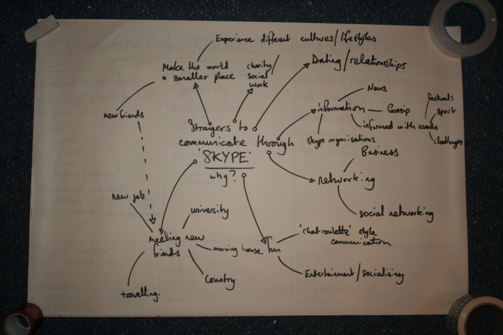
Also, for the target audience I focused originally on producing advertising specifically relationships/love. But, with a strong concept statement 'Skype brings people together' I want to open up the brief again and develop why skype should bring people together, as strangers then eventually friends.

So yeah, thats the next step, work more literally with the concept statement with a wider audience in mind. And get researching!

Brief! Pre first crit.


Initial concept development

Best viewed large. Click the images!


What and why? a breakdown of everything i enjoy through Graphic design, and I find myself adding to the list each day.. Originally I thought the list would be quite minimal with maybe layout, typography and packaging.. but the more you think about it, the more diverse you realise yourself to be. Obviously these all wouldn't be relevant for particular briefs, but as a starting point it was really useful.


The Panamax brief grabbed my attention because the control, limitations and requirements it demanded. I always enjoy working with limitations because it allows for creative development in the right direction.


Instantly thinking typography and advertising, the Skype brief was asking for ways of communication and I felt something human/natural and involving public interaction would be really useful here.


Very conceptual, and a really good basis for a starting point for another brief, or audience. The original brief asks for interaction between strangers on public transport, but I felt that wasn't a direction to take, so I broadened my ideas.


Breaking down ideas further with what i want to produce, I have a few key ideas, just a case of combining and applying them to content.


The brief decided would be a skype/talk public hybrid, combining the interaction of talk public but the context through skype devices.


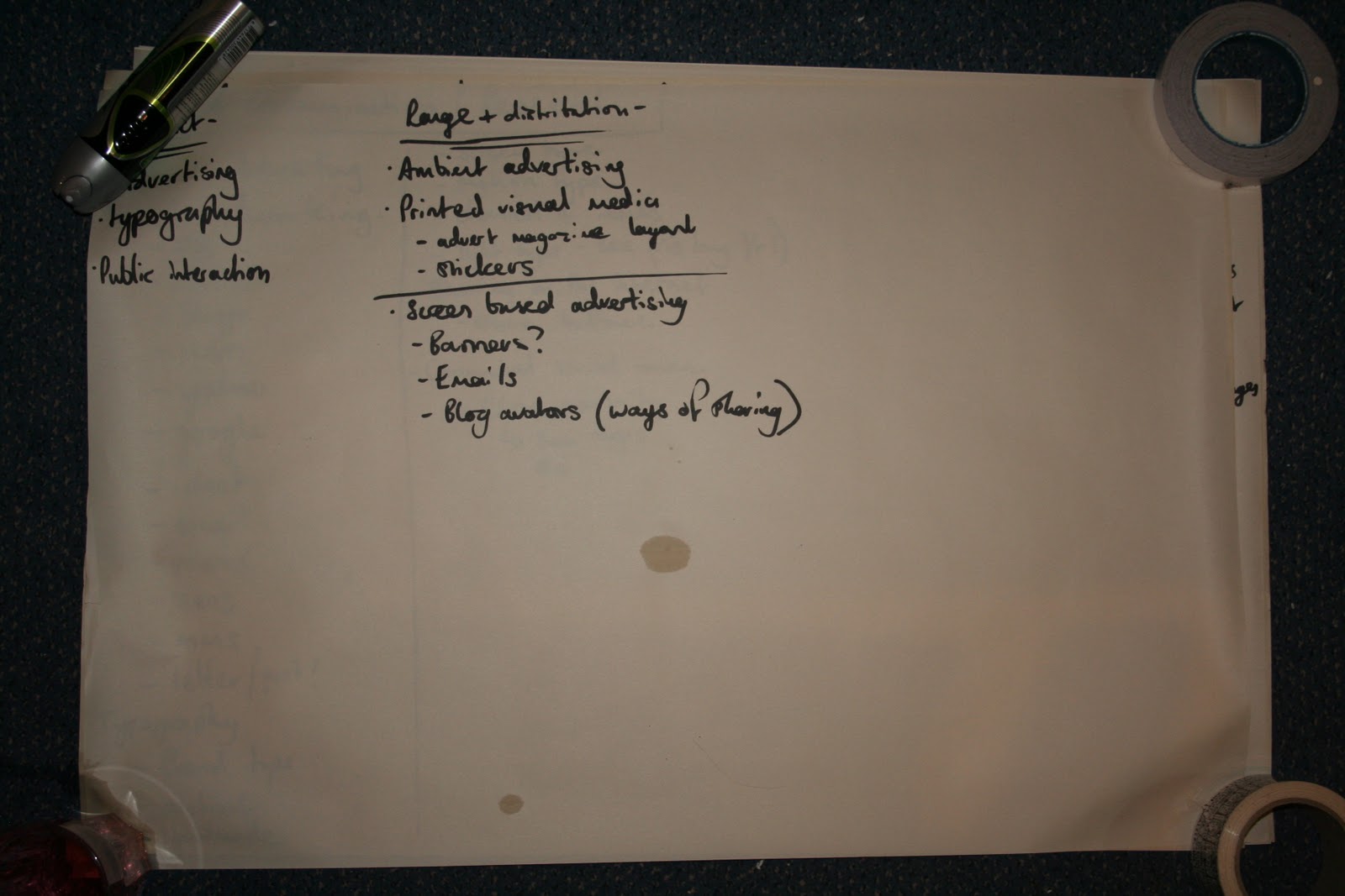
Possible audience breakdown and product/outcome potentials.