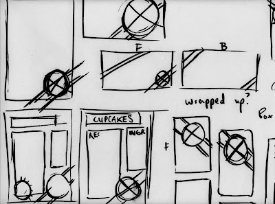
With a logo in place, this stage is a much faster process, (or atleast was) for producing visuals for the identity. Although largely rough drafts of work at the moment, just the beginning of further development.
An a5 recipe card layout, little bit of practice with layout/point size and placement of features. Working off a clean simple approach to the design, making it straight forward to follow. Typographic treatments followed, as a little bit promotional element to the identity.
*Vector based glow applied to the design developed from screen based experimentation. (posted a little later on)
Business card designs came quite easily because I already have a clear idea of what I want to produce, I like the idea of introducing labels/ ribbons to the design to 'tie' everything together.. geddit?
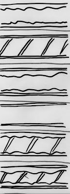
Some experimentation with ribbons/patterns design to manipulate. Using the same effect as the outer logo circle, I manipulated a random pattern to produce a repeat stroke as a starting point, then adding chosen colours.
With packaging in mind, developing visuals for transporting cakes was important, but I felt wasn't necessary to develop new packaging nets. With many successful nets already produced, applying graphics to them seemed like a stronger more cost effective way of having branded material. With nets to be bought depending on the cake order, applying visuals that Kat can do herself seemed like a no brainer. Producing adhesive material to be applied quickly was the direction to take, and will need to be experimented with to see how successful this is. I do have a few ideas for completely original packaging nets, and will be explored with suited/time available.


0 comments:
Post a Comment