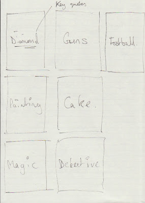
To get the ball rolling with the Guy Ritchie brief, just starting with laying out some notes and making some decisions, with what direction I should take. Originally the brief was to produce visuals for films either written or directed by Guy Ritchie, this left me with 4 films which I felt wasn't enough for the potential of a Series of posters/dvd covers. I later found out that Guy produced Mean Machine, and was an influence to Layer Cake, Directed by Matthew Vaughn. These seemed like obvious additions and allowed more scope for ideas.
With type as the focus, Just to start working with colour and layout, just started with key colours and themes for each of the films and made some samples, shown below.
Top - Bottom, Left - Right :
Sherlock Holmes, Layer Cake, Snatch, RocknRolla, Mean Machine, Lock, Stock and two smoking Barrels.


0 comments:
Post a Comment