Recent Posts

Wednesday, 27 October 2010

Kat Gardner - Identity - Screen potential.

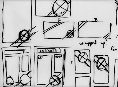
Developing screen based visuals is purely for consideration to the design, and not key to the identity development. If a website is to be produced, it would probably go along the lines of something like this.


Folder dividers used to collect and collate recipes was the original idea for producing headers for the designs, and I just went with it, trying different variations and treatments.


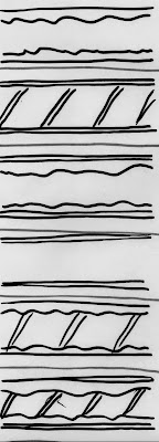
Working with the ribbon patterns created previously, I still feel aren't strong enough in a variety of treatments, aswell as just ribbon so other patterns and colour combinations were created, including the 'rising sun' vector behind the logo, reflecting on her interests.


Monday, 25 October 2010

Kat Gardner - Identity - Placement. Thoughts + Development.

With a logo in place, this stage is a much faster process, (or atleast was) for producing visuals for the identity. Although largely rough drafts of work at the moment, just the beginning of further development.


An a5 recipe card layout, little bit of practice with layout/point size and placement of features. Working off a clean simple approach to the design, making it straight forward to follow. Typographic treatments followed, as a little bit promotional element to the identity.


*Vector based glow applied to the design developed from screen based experimentation. (posted a little later on)


Business card designs came quite easily because I already have a clear idea of what I want to produce, I like the idea of introducing labels/ ribbons to the design to 'tie' everything together.. geddit?


Some experimentation with ribbons/patterns design to manipulate. Using the same effect as the outer logo circle, I manipulated a random pattern to produce a repeat stroke as a starting point, then adding chosen colours.


With packaging in mind, developing visuals for transporting cakes was important, but I felt wasn't necessary to develop new packaging nets. With many successful nets already produced, applying graphics to them seemed like a stronger more cost effective way of having branded material. With nets to be bought depending on the cake order, applying visuals that Kat can do herself seemed like a no brainer. Producing adhesive material to be applied quickly was the direction to take, and will need to be experimented with to see how successful this is. I do have a few ideas for completely original packaging nets, and will be explored with suited/time available.


Sunday, 24 October 2010

Kat Gardner - Identity - Development - Colour


Colour! the introduction of colour should develop the design much further, and hopefully not being too complicated work on a variety of scales. I learnt from a previous identity (MWA) that applying too many tones and colours to a design, just loses the justification and effectiveness of the design.  


The spiral added to the design adds a little more depth without over complicating the design, with a little more subtle detail to the design. The colours decided are collected from various colour combinations and pastel colours related and associated with the target audience and field, delicate and simple, relaxed and approachable. Blues and turquoises in addition give a feminine feel, but not too much ignore a wider audience.


With 4 colourways decided on the logo, development further now is needed to take this brief further. This being one of the most successful identity briefs so far, it would be strange to stop now without exploring other printed potential and consider screen. Website layouts? packaging/bags/boxes for cakes? applying to stationery?


Friday, 22 October 2010

New Statement of Intent.


Thursday, 21 October 2010

Timetable. Tha plan.


My timetable! well atleast a rough copy for day to day organisation. I always do them, get out of the habit of updating them and creating new ones and wonder why i'm so disorganised. hmm. This should put me in good stead, factoring in work, actual deadlines and rota'd crits. Ill refresh the timetable towards the end to plan for the next few weeks afterwards.

Kat Gardner - Identity - Development


'GDC' or Gardner Decorated cakes was a starting point, working with simple rounded typefaces and letterforms for a more natural relaxed approach to the identity, but didn't seem to sit very comfortably on the page, so variations on that were introduced, 'Kat Gardner - Decorated Cakes' works the best.


Introduction of the pictograms to develop were experimented with, with poor results. little disappointed with the outcome, and with feedback from colleagues meant they weren't conveying the right information. I do like the layout personally, but reminded myself too much of contextual research collected.

Surrounding the type within a cupcake case/circle still quite well, but with development of placement lead to the design below. The edge of the case/circle was decided through manipulation of repeat patterns (similar to spirograph treatments made previously) to create a 'frosting whipped' effect, like a cupcake.


Kat Gardner - Identity - Initial ideas

Kat Gardner is a freelance baker and cake decorator I know from a part -time job who approached me about an identity for her work just to promote herself a little more. Her business works on word of mouth currently so business cards is a must, with the potential to expand and develop further with work. Weirdly first job was to devise a name for her freelance work, to allow business other than family and friends. 'Kat Gardner - Decorated Cakes' after various changes on a baking and decorating treatment, which just sounded like a decorator painter. Kat bakes and decorates from her own recipe from start to finish, so a personal approachable feeling is also a must. Her interests although might not be relevant is Japanense, currently taking a course in the language, might be nice to include some subtle influences into the designs.


With quite a scope of development/ideas to be had, just began with simple imagery and typographic treatments for logo ideas, working again with initials, small pictograms and general cake/cupcake imagery to draw conclusions to ideas.


With Kat producing cakes from start to finish, the idea of incorporating 'love and care' into the designs seemed like a no brainer. working on 'love and care in a cupcake' lead onto manipulating on screen where treatments could be produced relatively quickly. 'GDC' was a strong direction at this stage, twinning with small pictograms, but will only be decided with further development.


Identities lined up.

Over the next few weeks, I will be continuing the identity weekly briefs and introducing new designs and directions to experiment with. With previous weeks the 'weekly' identities have ate into much more time than expected, but as a benefit developed much more stronger work as a result of it. The briefs lined up will be purely a starting point, if successful, will progress into bigger and better things! Okay, so a quick run down -

Kat Gardner - Baking and Decorating Cakes (21/10/10)

Freelance Cake baker and decorator operating in leeds will need an identity, business cards then the potential for screen based design, imagery for a blog based site. With deliveries being made of cakes and creations, visuals applied to packaging should be considered if designs are successful.

Sunglasses UK - Sunglasses Website (28/10/10)

Redesign of the logo and style guide for the sunglasses supplier website. If designs successful, continue further with print based media where relevant.

Emma Hallam Floristry -  Freelance Florist (09/11/10)

Identity for a freelance Florist based on weddings and larger occasions for flowers. Simple and effective, letting the flowers speaking for themselves. Approachable and accessible.


Wednesday, 20 October 2010

Progress crits. Feedback.


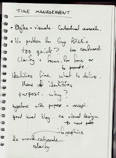
The feedback and my thoughts from the crit recently. Such a good group to be in this time around. With this being the first real crit looking back at work I feel that (especially in my group) everyone has taken it to a another level with how the crit is run, better feedback, more questions, much more indepth and detail and much more understanding. This particular crit I wasn't best looking forward to, with the format of the module being very self-directed, I definitely felt a few occasions of the feeling of plodding on with work, no real deadlines and understanding of the time-frame. This, something I have definitely learnt from the crit. My current work ethic had little structure to it, picking pieces of work and briefs at random and progressing in each field. This lead to basically not producing enough work on a whole for the crit (at least I felt that way.) The feedback I received was clear and concise and very useful to build from,  rising many questions to make myself and make decisions with my practice. Clarification was a key part of the feedback. Give myself clarification. understand the problem in hand, and create a relevant solution. This I feel was partly down to partly bad constructed briefs, and keeping to a timeframe.

Ok, so whats next?

Organise some timeframes for briefs
Plan a timetable to stick to factoring in dissertation, identity briefs and larger briefs.
More visual research more 'Graphic Design' on the context blog.
Clarify briefs/themes.
Statement of intent right?


Tuesday, 19 October 2010

Market Week - Identity

Recently completed and handed in today, another day/short Identity brief set, again live but for part of the University programmes in the future. Market week, is all about producing shows/exhibitions of work by people involved in Leeds College of Art wether they are Students, alumni, staff or associates. The shows/exhibitions are a basis for networking among the creative community and to build business opportunities for both applicants and 'customers' The concept seems strong, and interesting to create some visuals for them. The brief asks for a logo, then some sample layouts of potential outcomes. 


With such a wide focus for visuals, taking a more conceptual approach would allow me to create more universal visuals but still with an underlying theme. Ive been recently been working on spirograph stylised patterns (shown above) for another brief/personal use, so as a starting point worked with that.


Reverting to solid colours instead of line drawing created some interesting patterns, and with 'overprinting' separate colours, allowed for real potential.


Combining different colours together created much more interesting patterns, and became the basis for the concept I was trying to visualise. Combining individual talents (separate colours) to provide new and exciting opportunities. From there, the design progressed and type was introduced.


From L-R 

Logo
Invitation
Banner
leaflet/promo layout

Typeface used - Gotham Rounded

In the final layouts, I included a QR code to the designs to add a little depth/third dimension to the design. A QR code is a interactive barcode using a smartphone or webcam for augmented reality (or in this case) an interactive link to an online resource, wherethe a image, website or message. I included it to allow the user to be directed to a website (in this case the college website) If you have an Android/blackberry/iphone with a barcode scanner application, try it out!


I really enjoyed this brief, another relatively fast turn around piece of design to add to the portfolio. Really happy with the outcome, and will hopefully continue with more opportunities like it.