Recent Posts

Thursday, 30 September 2010

Beer for Beginners - Initial thoughts


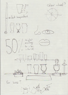
With infographics used to display data and statistics in visually interesting ways, I thought that beer would be a good example for varieties of beer and interesting facts. Although there are plenty of facts and statistics about beer, where-the or not they are useful is another matter. I feel in order for the design to be successful, the infographics needs to focus on more useful information like enjoying beer properly, tasting beer and knowing the differences. With plenty of varieties of beer, creating visuals purely on differences would be strong enough, instead of having to explaining 'how many guinness' were served last week' for example.


 The focus- Differences in beers, how to enjoy different beers, Complimenting flavours with beer. Currently continuing with pictograms and laying out step by steps for ideas. I feel research into layouts and more content will definitely drive my designs further.

Wednesday, 29 September 2010

The statement that is my Umbrella.

'Effectively visualise data and information in a variety of typographically driven print solutions'

The chosen briefs (for now)

Ok, from the written briefs over the summer, these are the 5 (not including live brief) I will progress with  over the coming weeks to produce work from and as starting points. One of the briefs I have left out is the 'Beautiful Characters' brief, a T-shirt company identity/t-shirts/production brief. I have decided to wait until the new year to produce this brief purely for what I want to achieve, I feel it will be a strong FMP brief to consider. The 5 chosen I feel are a nice selection of work, showing variety and demonstrating skills, but not completely different to show no direction. As previously mentioned, this year (and beyond) is typographically driven, and reflects the brief choices. 

Element Skateboards is a brand I admire and a field I want to consider. To produce skateboards for the ethical brand Element as a series, either for pro riders or under an aspect of the brand's ethics to producing products and progress in Skateboarding.

 Touching on infographics previously for portions of briefs, I want to produce information graphics to display the differences between beer and ways to enjoy beer. This brief will require visual building, pictograms/logos and type based compositions for a variety of outputs. Poster formats, printed layout and the possibility of an iOS application. With Beer or 'real ale' given a very old traditional stereotype, I feel this is an opportunity to produce visuals to challenge the perception.


One of my favourite writers/directors/producers. Guy Ritchie, I feel is one of the strongest Film makers in this country for my generation and needs to be celebrated. The brief is to produce film posters/DVD covers for a selection of Guy Ritchie Films. **update** to expand on a selection of films to work from, the brief will be films written/produced/directed/inspired by Guy Ritchie as a series.

 To experiment with type as image and work with compositions of type, 'Don't Panic, its just type' is using don't panic themes as a starting point to produce A2 screenprints with limited colour as a series. This brief has the possibility to be spread over a the coming weeks in 2+ days spurts for a fast turn around and working with type in a variety of ways.

The brief to produce an Identity for Architect Matthew Whatley including Logo, chosen type and displayed in a variety or formats including Business cards and stationery. From recent discussions in the studio with tutors/fellow students producing an identity of this kind should really be a relatively fast turn over of work, to be more realistic in a professional environment. This could be seen as a week-long brief,  or even shorter? 

Tuesday, 28 September 2010

Guy Ritchie - Initial thoughts

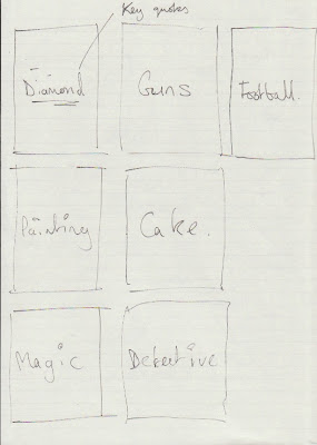
To get the ball rolling with the Guy Ritchie brief, just starting with laying out some notes and making some decisions, with what direction I should take. Originally the brief was to produce visuals for films either written or directed by Guy Ritchie, this left me with 4 films which I felt wasn't enough for the potential of a Series of posters/dvd covers. I later found out that Guy produced Mean Machine, and was an influence to Layer Cake, Directed by Matthew Vaughn. These seemed like obvious additions and allowed more scope for ideas.


With type as the focus, Just to start working with colour and layout, just started with key colours and themes for each of the films and made some samples, shown below.


 Top - Bottom, Left - Right :
Sherlock Holmes, Layer Cake, Snatch, RocknRolla, Mean Machine, Lock, Stock and two smoking Barrels.


Monday, 27 September 2010

The briefs.


Really like the select briefs I have chosen from ones written over the summer. It really started with a list of products I wanted to produce and wrote from there. I think this year will be the best chance to take advantage of the amazing position i'm in to produce work I've always wanted to produce. Obviously I won't be able to produce all 8 briefs to the standard I want (or will I?), but as a starting pointing work from what I have. Its been discussed some will obviously be shorter than others, so I might have some multiple briefs? I quite like the idea of doing some very short briefs, quick turn over and more realistic timeframes. Keep some variety in a week and force myself to make more informed faster decisions. These are as they stand for now, and will change after the crit/as time fits.

Anyway you want it.

Ok, so in order to make more informed decisions about what I want to produce over the next few months (and beyond) Ive compiled a list of wants and don't wants in order to structure my work and create beneficial briefs.

What I want and why-

High end print skills relevant to the project 
- To produce high end outcomes for a variety of mediums. Attention to detail is key.

Produce a variety of packaging solutions
- Opportunity to work with a variety of stock, budgets clients + effective use of material. Majority of the time its great to go crazy with stock and have rich varieties of  materials and finishes, but I also want to create solutions that have the same merit, but with a smaller budget and just as effective.

Effectively visualise data / information
- Create graphic design with a purpose, display important information in a variety of ways including considering limitations and accessibility. Making potentially boring/laborious information readable and interesting.

Typography in all forms
-Typography is going to be a largest part of my third year, and probably future career. I want to explore semiotics and variations produced for different purposes. Creating typefaces, type as image, compositions, layout/editorial, found type and logo design. I want to look at how type is read and its effect on the user.

Branding and Identity
-To create an individual experience with a variety of combined techniques including type, print, logo design and selective use of colour for reader and output. Graphic Design with a purpose.


What i don't want and why-

To illustrate
-With the variety of illustrators around, it makes sense to decide on an illustrator suited for the job and collaborate, instead of adapting your own style. If you can't beat them, just hire them.

Develop Web design skills
-Designing for web yes, but not producing websites from scratch. Someone will be able to do it in half the time, faster and much cheaper than I would be able to.

Moving image
- A whole other direction to produce work, introducing another dimension takes dedication and lots of practice to produce the standard of effective work. I just don't have the skills base.

Handmade
- Translating ideas into handmade visuals means there are less control on outcomes, and isn't to my nature. COnverting handmade visuals to industry standard prints/screen loses the handmade qualities anyway.

Character/vinyl design
-Although an interest to collect vinyl toys, production to get the standard I would want would involve a large commitment, compromising my other and stronger interests.


As part of PPD, I will update a visual gallery of work I want to produce and Design I find inspirational.

Ok, lets go.

'Be careful to take risks. Time is genetic. Today is the child of yesterday and the parent of tomorrow. The work you produce today will create your future.' Bruce Mau, 1998

Little quote at the top of the module briefing, I think its safe to say everyone is motivated, anxious and excited all at the same time right now. Its good to be back, and I'm ready to work.